MU = ∂U/∂x Y = β₀ + β₁X + ε ∑(Y - Ŷ)² → min P = MC U = f(x₁, x₂, ..., xₙ) r = (1 + i)ⁿ - 1 Q = f(K, L) lnY = α + βlnX ∂L/∂λ = 0 MRS = -dy/dx

Portfolio

PP 434 | Automated Data Visualization

This portfolio showcases the diverse array of data visualization and data analysis skills I have aquired in PP434.

1. Hosting

Here I've embedded charts produced by other analyst. In this case I've added charts on crypto and emissions data from Richard Davies of the Economics Observatory.

2. Building

Here are a couple of charts where I am experimenting with some minimalist and maximalist visual styles.

3. Debating

At the Festival of Economics, the author of "Beyond Fair Play" called out the myth that GDP growth makes society fairer, especially for the bottom deciles.

When fairness is measured by the income share of the bottom 10%, the data can be presented in ways that both support and reject the author's argument.
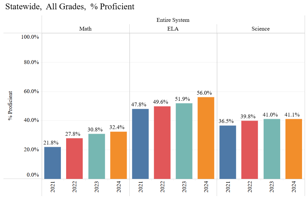
4. Replication

I recreated and then enhanced a chart on test score results in Alabama. I replaced the bar chart with a line because it conveys the trend over time more effectively.

5. Scraper

I scraped the U.S. Presidents' Wikipedia page and calculated their ages at inauguration using their birth and inauguration dates. Python Code

6. Loops Dashboard

I created a dashboard looping the ONS API in python. The dashboard displays household consumption exppenditure on a variety of goods and services.

7. Maps

Two chloropleth maps of the counties in Alabama with the latter capturing the spatial distribution of the population.

8. Big Data

I merged and filtered DataFrames to analyze tea and coffee retail prices, using pandas in python to calculate monthly median prices and create a price index. After data transformation and aggregation, I used Vega-Lite to visualize price trends through multi-line charts, tracking changes from 2023-2024.

9. Analytics Charts

These two charts investigate Bitcoin's electricity usage in Twh. By detrending we are able to see how the Volatility in energy consumption has changed over time.

10. Interactive Visualisations

The first chart is a simply histogram distribution with a built in time slider which tracks the rolling median value. The second is a scatter chart and LOESS regression plot which also features a time slider/